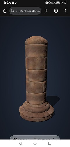
I’ve been experiencing this behavior since yesterday. The video is from an iPhone, the screenshot from an Android device.
Hi Matthias, thanks for the details. It sounds like you’re experiencing a display issue with the built‐in Needle Menu on mobile devices. There have been several adjustments in recent releases—such as mobile button height tweaks in version 3.47.7 and refinements around safe area handling in later updates (see the changelog entries at CHANGELOG.md)—that addressed similar issues.
Could you please confirm which version of Needle Engine you’re using? If you’re on an older release, upgrading to the latest version might resolve the problem automatically. Also, if you’ve applied any custom CSS or modified the menu component, double‑check that your changes aren’t conflicting with the built‑in mobile styling.
If you’re already on the latest version and the issue persists, it would be very helpful to get a minimal reproducible example (for instance via Needle-engine - Vite Template (duplicated) - StackBlitz) or additional details like any console warnings. This extra information will help narrow down whether the problem stems from a configuration issue or might be a bug needing further investigation.
Let me know what you find, and we can dive deeper if needed.
1 replies left - Become PRO for more replies.
thread_N2bYdEzzvVRX7Tr8zErZZ4KH
Reply to this post directly if you need further help (bottom right button)
Hello Matthias, this most likely means your <needle-engine> component is larger than the screen. Can you double check your CSS? (e.g. by adding a border to the needle engine web component border: 2px solid red to visualize the bounds and verify that it doesnt overlap on any side)
Good tip, I see there are several CSS stories here. I need to clean up some stuff.
This topic was automatically closed 13 days after the last reply. New replies are no longer allowed.
